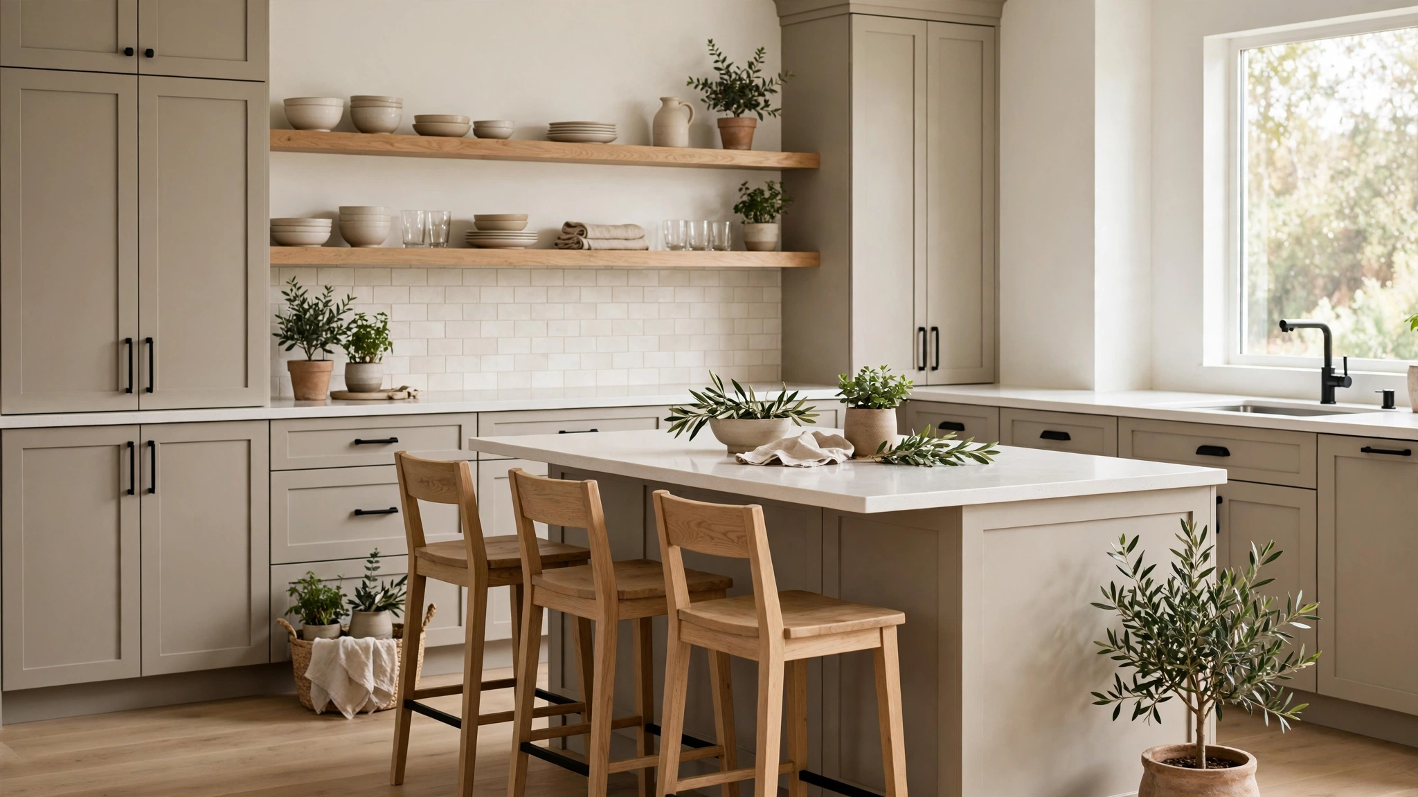

15 Kitchen Color Schemes That Work
Choosing colors for your kitchen is one of the biggest design decisions you’ll make in your home, and honestly, it can feel a little overwhelming. The kitchen is where mornings start, dinners happen, and everyone ends up gathering at the party, so the colors you pick shape the mood of your whole day. A great kitchen color scheme isn’t about picking one “right” shade — it’s about the way your cabinets, walls, countertops, and accents play together to create a space that feels like home.
The secret to a scheme that truly works? Balance. Pair warm with cool, bold with neutral, and light with dark so every surface has a partner. Whether you’re working with a tiny galley kitchen or an open-concept dream space, the right combination will make the room feel bigger, brighter, and more put-together. We’ve rounded up fifteen tried-and-true kitchen color schemes — each with the exact cabinet, wall, countertop, and accent pairings to pull them off beautifully. Save your favorites and start swatching!
—
1. Warm White and Butcher Block
There’s a reason this combination never goes out of style: warm white cabinets paired with butcher block countertops create a kitchen that feels like a cozy farmhouse morning, every single day. Choose a warm white with creamy undertones (think vanilla or linen rather than a stark blue-white) for your cabinets so the space feels inviting instead of clinical. Butcher block counters — in a honey or medium maple tone — add natural warmth and texture that keeps all that white from feeling flat. For walls, carry the warm white up or add a soft off-white subway tile backsplash. Flooring works best in a medium wood tone that echoes the counters. Add black or oil-rubbed bronze hardware for a little contrast, and style open shelves with wooden cutting boards, ceramic canisters, and a small trailing plant. This scheme is forgiving on a budget too, since laminate or stock cabinets in warm white and an affordable butcher block slab deliver the whole look.
2. Navy Blue and Brass with White Marble
If you want a kitchen that feels sophisticated the moment you walk in, navy cabinets with brass hardware and white marble-look countertops are a showstopper. The deep navy — something like a midnight or ink blue — grounds the room and reads almost like a neutral, while brushed brass pulls and knobs add warmth and a jewelry-box finish. Keep the walls light: soft white or a pale warm gray lets the navy be the star. A white marble or quartz countertop with subtle gray veining brightens the work surfaces and keeps the dark cabinets from closing the room in. For the backsplash, classic white subway tile or handmade-look ceramic tile adds texture without competing. This scheme shines in kitchens with decent natural light, and it photographs beautifully, which is why it’s an all-time Pinterest favorite. Style with a brass pendant over the island and a few wooden accents to soften the formality.
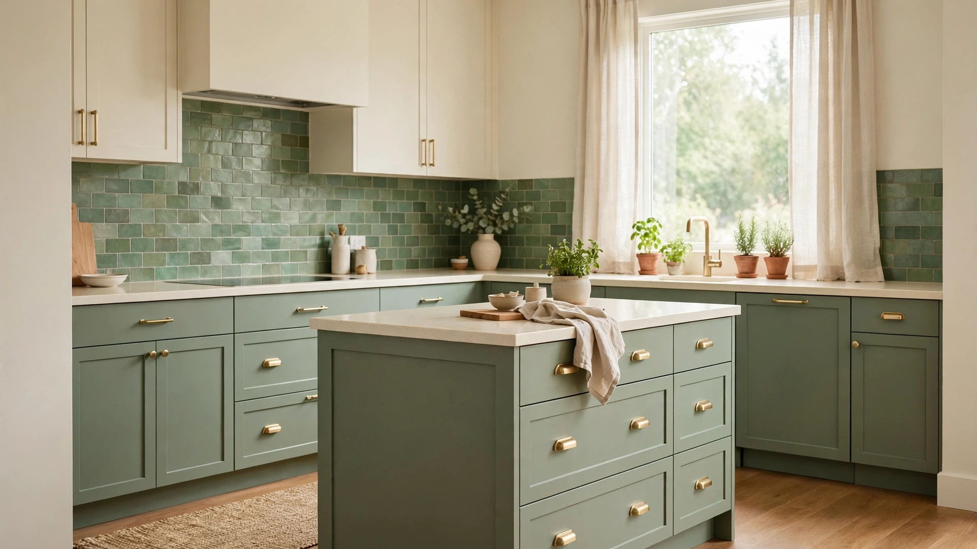
3. Sage Green and Cream
Sage green is the color that made everyone fall in love with green kitchens again, and paired with cream it feels fresh, calm, and timeless. Use sage on the lower cabinets or a kitchen island, and keep the uppers — and the walls — in a soft cream so the room stays airy. Cream countertops in quartz or solid surface keep the palette light, while a sage or handmade green tile backsplash ties the island color up through the room. Warm wood floors or a medium oak add an earthy base that complements sage perfectly. For hardware, brushed gold or antique brass echoes the warmth of the cream, though matte black works beautifully for a more modern edge. This scheme loves natural textures: linen curtains, a jute runner, woven baskets on open shelves, and fresh herbs in a sunny window. It’s a gentle, livable combination that works in both cottage kitchens and updated modern spaces.
4. Charcoal Gray and Light Oak
Charcoal gray cabinets with light oak accents strike that perfect balance between moody and warm — modern without feeling cold. Paint base cabinets or the full kitchen in a soft charcoal (a gray with warm undertones so it doesn’t read blue), then break it up with light oak: open shelving, a butcher-block island top, or oak floating shelves against the wall. White or very light gray walls keep the room feeling open, and a light quartz countertop in white or pale gray brightens the workspace. A simple gray or white subway tile backsplash keeps things clean. Stainless or matte black appliances both work here; choose matte black hardware for a cohesive modern look. Add warmth with a light oak stool set, a patterned runner in grays and creams, and greenery. This scheme is especially great for open-plan kitchens because the charcoal anchors the space visually against lighter living areas.
5. Classic White and Carrara Marble
The all-white kitchen with Carrara marble is a classic for a reason: it’s bright, timeless, and makes even a small kitchen feel twice as big. Use a clean, slightly warm white on the cabinets (Shaker-style fronts are the go-to), and let real or look-alike Carrara marble — with its soft gray veining — be the star on countertops and even the backsplash for a seamless, high-end look. Walls can stay white or go a whisper of warm gray to add the faintest definition. Polished nickel or chrome hardware keeps the look crisp and classic, while a white or marble-tile floor continues the seamless feel (or add contrast with a medium wood floor for warmth). Style minimally: a marble pastry board, a small vase of white flowers, glass canisters. The key to keeping this scheme from feeling sterile is texture — mix matte cabinet paint with polished stone, add a linen shade on a pendant, and let a wooden stool or two bring in a natural note.
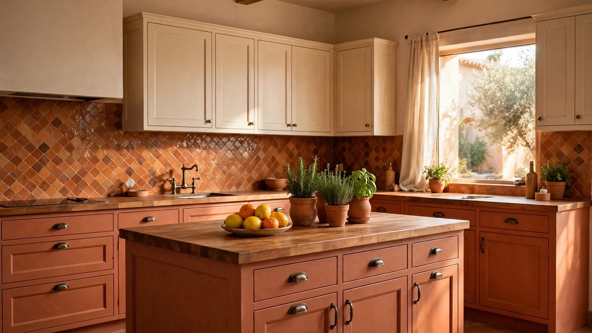
6. Terracotta and Warm Beige
Terracotta brings the warmth of a Mediterranean villa straight into your kitchen, and paired with warm beige it’s cozy without being heavy. Use terracotta on a feature — a kitchen island, a range hood wall, or lower cabinets — with warm beige or sandy walls and upper cabinets to keep the palette sunlit. Butcher block or a warm beige quartz countertop continues the earthy feel, and handmade terracotta or zellige-look tiles in the backsplash add gorgeous variation and glow. Dark wood floors or terracotta-look tile flooring ground the room beautifully. For hardware, oil-rubbed bronze or matte black adds definition without cooling the palette down. This scheme begs for natural styling: clay pots with herbs, wooden spoons in a crock, woven placemats, and a bowl of citrus on the counter. It works especially well in kitchens that get warm afternoon light, where the terracotta practically glows. Keep the ceiling and trim a clean warm white for contrast.
7. Forest Green and Walnut
Deep forest green with rich walnut is a combination that feels like a woodland retreat — dramatic, warm, and surprisingly versatile. Paint cabinets in a deep forest or hunter green and pair them with walnut accents: a walnut island top, open walnut shelves, or walnut bar stools. The wood’s warm brown tones keep the dark green from feeling heavy. Lighten things up with creamy white walls and a white or light quartz countertop, plus a cream or handmade off-white tile backsplash that reflects light around the room. Brass hardware is the perfect jewelry for this scheme — it glows against the green and picks up the warmth of the walnut. Style with leather, stone, and linen textures, and add plenty of plants; green-on-green with real foliage looks incredible. This palette suits both traditional kitchens with detailed cabinetry and modern flat-front designs, and it pairs beautifully with warm wood floors.
8. Pale Blue and White with Gray Counters
Pale blue and white is the kitchen equivalent of a deep breath — calm, fresh, and endlessly livable. Paint cabinets in a soft powder or sky blue, keeping walls and ceiling bright white so the blue feels like a gentle wash of color rather than a statement. Light gray quartz or solid-surface countertops add a cool, clean work surface that bridges the blue and white, and a white subway or pale blue glass tile backsplash keeps the palette serene. Polished nickel or chrome hardware suits the crisp, coastal feel; brushed brass can warm it up if you prefer. Light wood or whitewashed floors complete the breezy look. This scheme is a dream for small or dark kitchens because the pale blue reflects light almost as well as white while adding personality. Style with white ceramics, a striped runner in blue and white, and fresh flowers. It’s classic coastal without a single seashell in sight.

9. Black and White with Wood Accents
Black and white is the most graphic, high-contrast kitchen scheme there is — and a touch of wood keeps it from feeling stark. The classic move: black lower cabinets, white uppers, white walls, and white countertops, with warm wood brought in through open shelving, a butcher-block island top, or oak bar stools. Alternatively, go all-black on the island with white perimeter cabinets. A white subway tile backsplash with dark grout adds pattern and ties the two tones together. Matte black hardware on white cabinets (and vice versa) keeps the contrast intentional. Light or medium wood floors warm up the whole composition. This scheme works in any style — modern flat-front, classic Shaker, even farmhouse — because the palette is so fundamental. Style with restraint: a few black-and-white art prints, wooden cutting boards, and one great pendant light. Keep clutter off the counters, since high-contrast rooms show mess more readily.
10. Cream and Soft Gray with Marble Touches
Cream and soft gray is the quiet luxury of kitchen color schemes — warm, elegant, and completely timeless. Use cream on the cabinets (a rich, buttery cream rather than stark white), soft warm-gray on the walls, and let marble — real or marble-look quartz — appear on the countertops and backsplash for that veined, high-end texture. The cream keeps the gray from feeling cold, and the gray keeps the cream from feeling yellow. Brushed nickel or champagne-bronze hardware both suit this palette; choose based on whether you want a cooler or warmer finish. Medium wood floors add a natural base, or go with a classic checkerboard tile floor in cream and gray for vintage charm. Style with glass-front uppers showing white dishware, a small marble tray corralling oils by the range, and soft linen textiles. This scheme is perfect if you love the white-kitchen look but want something a touch warmer and more distinctive.
11. Olive Green and Natural Stone
Olive green with natural stone tones creates an earthy, grounded kitchen that feels connected to nature. Paint lower cabinets or the island in a muted olive — a green with brown undertones that reads sophisticated, not bright — and keep uppers and walls in a warm off-white. Countertops in a honed beige or warm gray stone (or a stone-look quartz) bring in the “natural stone” element with beautiful matte texture. A handmade cream or beige tile backsplash adds artisanal variation. This scheme loves warm metals: unlacquered brass or aged bronze hardware develops a patina that suits the earthy palette perfectly. Wood floors in a medium tone, or even stone-look tile, complete the natural feel. Style with pottery in earth tones, wooden utensils, dried herbs, and linen in oatmeal and sage. Olive is wonderfully forgiving — it hides wear well and pairs with almost any accent color you add later, from terracotta to mustard to deep brown.
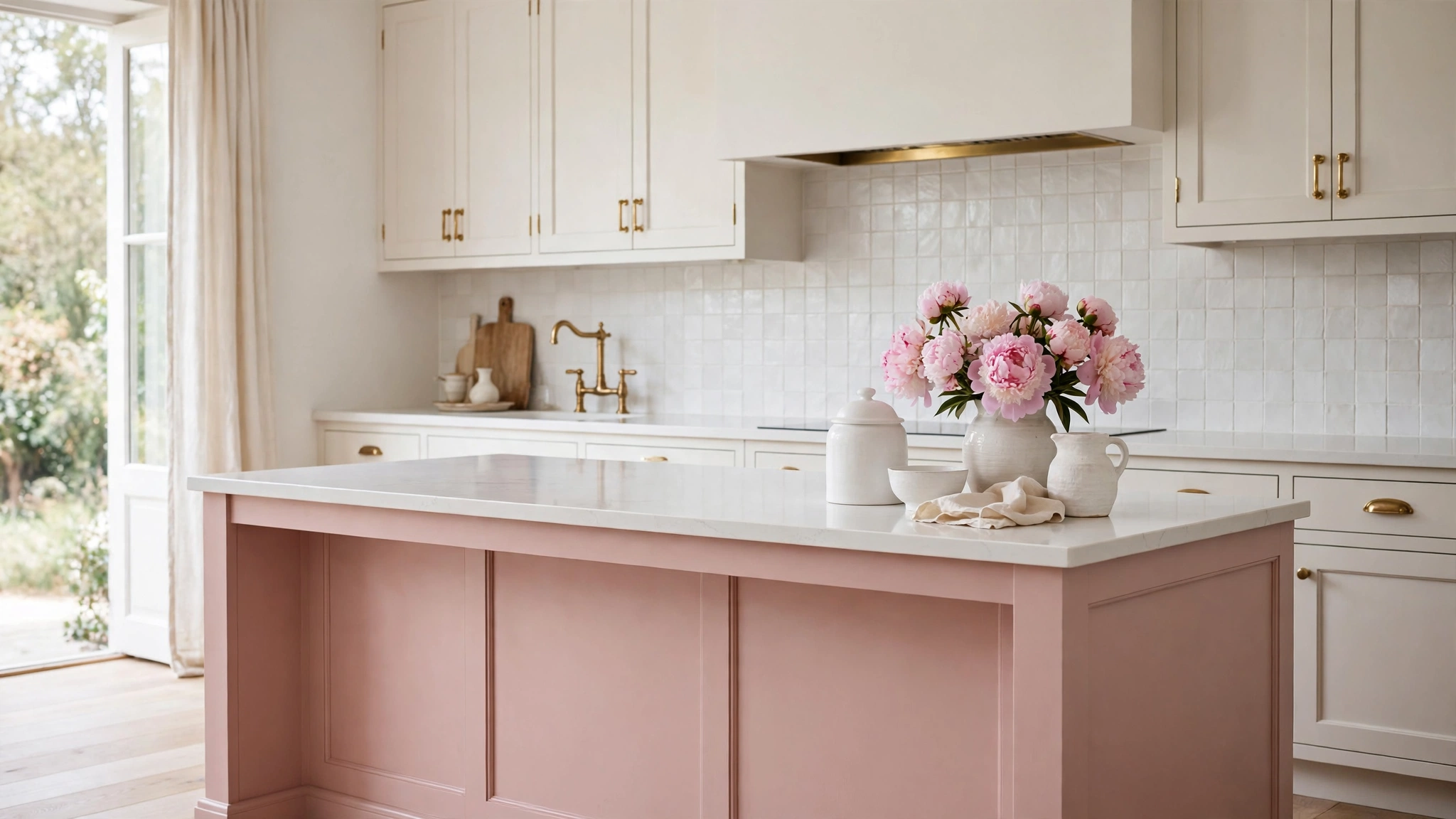
12. Blush Pink and Warm White
Blush pink might sound daring for a kitchen, but in a soft, dusty tone with warm white it’s romantic, fresh, and surprisingly sophisticated. Use blush on the lower cabinets or island — a muted, grown-up pink with beige undertones, never bubblegum — and keep uppers, walls, and ceiling in warm white. White quartz or marble-look countertops keep the palette light and clean, while a white or pale pink handmade tile backsplash adds subtle shimmer. Brushed brass or champagne hardware is the perfect warm metallic here; it makes the blush glow. Light wood floors keep the room feeling airy. Style with white ceramics, a vase of pink peonies or roses, marble serving boards, and soft textiles in cream and blush. This scheme works beautifully in small kitchens and breakfast nooks where you want maximum charm. If full blush cabinets feel like too much, try it just on the island — it’s the perfect low-commitment way to test the color.
13. Greige and White Oak
Greige — that perfect blend of gray and beige — with white oak is the modern neutral scheme for people who find all-white kitchens a little cold. Paint cabinets in a warm greige that shifts beautifully with the light, reading gray in the morning and beige by evening. White oak accents — open shelves, a range hood surround, or bar stools — add pale, honeyed wood warmth that keeps the greige feeling rich rather than flat. White or light quartz countertops brighten the work zones, and a simple off-white or greige tile backsplash keeps the palette seamless. Walls can carry the same greige a shade lighter, or go warm white for more contrast. Matte black hardware adds a crisp modern edge; brushed brass warms it up. This is the ultimate “goes with everything” scheme — it pairs with stainless appliances, works in open plans, and lets you change accent colors seasonally without repainting a thing.
14. Teal and Warm Brass with Cream Walls
Teal brings joyful, saturated color to the kitchen, and with warm brass and cream walls it feels curated rather than loud. Use teal on lower cabinets or a statement island — a deep, rich teal with green-blue balance — while cream walls and white or cream uppers keep the room bright and balanced. Butcher block or warm white countertops both work; butcher block leans cozy, white quartz leans crisp. A cream or handmade white tile backsplash lets the teal be the undisputed star. Warm brass hardware, faucets, and pendants are essential here — the golden tones make teal look expensive and intentional. Medium wood floors ground the saturated color. Style with white dishware, wooden accents, and plants; the green in the teal loves real greenery nearby. This scheme is perfect for anyone who wants a colorful kitchen that still feels timeless — teal has enough depth to age gracefully, unlike trendier brights.
15. Warm Gray and White with Black Accents
Warm gray and white with black accents is the polished, put-together scheme that works in literally any home. Paint cabinets in a warm gray (one with beige undertones so it feels cozy, not industrial), keep walls and ceiling bright white, and add black through hardware, faucets, pendant lights, and maybe a black-framed window or two. White quartz countertops keep the workspace bright, and a white subway tile backsplash with light gray grout adds subtle pattern. The black accents are the key — they give the soft gray-and-white palette definition and a modern edge. Medium wood floors add warmth, or a gray-and-white patterned tile floor adds personality. Style with white ceramics, a black-and-white art print, wooden cutting boards, and fresh greenery. This scheme is incredibly forgiving: it hides everyday wear, suits any appliance finish, and transitions seamlessly into open living spaces. If you can only pick one safe-but-beautiful scheme, this is it.
—
Styling Tips
Start with your fixed elements. Before choosing paint colors, look at what you can’t easily change: your flooring, countertop material, and appliance finish. Build your scheme around those undertones. A warm travertine floor wants warm cabinet colors; cool gray tile wants cooler pairings. Fighting your fixed elements is the number-one reason color schemes feel “off.”
Follow the 60-30-10 rule. Let one color dominate about 60% of the room (usually cabinets or walls), a second color take 30% (countertops, island, or backsplash), and save 10% for accents (hardware, textiles, decor). This ratio keeps even bold schemes feeling balanced instead of chaotic.
Test colors in your actual light. Paint large swatches on poster board and move them around the kitchen at different times of day. A color that looks perfect under showroom lighting can shift dramatically in your north-facing kitchen at 7 a.m. Live with the swatches for at least two days before committing.
Repeat each color at least twice. A color used only once looks like a mistake; used twice or more, it looks intentional. If your island is navy, echo it in bar stools, a runner, or artwork. If brass is your hardware finish, repeat it in the faucet and lighting.
Mind the undertones. Two whites can clash badly if one is blue-white and the other is yellow-white. When mixing whites, creams, and grays, compare them side by side and make sure their undertones (warm vs. cool) agree. This single check prevents most color-mismatch regrets.
Use the backsplash as a bridge. Your backsplash sits exactly where cabinets meet countertops, so it’s the perfect place to blend the two. A tile that picks up tones from both surfaces ties the whole scheme together — think a handmade tile with variation, or a simple subway tile in a color pulled from your counters.
Don’t forget the ceiling and trim. A bright white ceiling lifts every scheme, while trim painted to match the cabinets (instead of default white) creates a custom, seamless look in dark or colored kitchens. In small kitchens, painting the ceiling the same color as the walls can make the room feel taller.
Add warmth through texture, not just color. Even the coolest gray or navy scheme feels inviting with the right textures: a jute runner, wooden cutting boards, woven baskets, linen curtains, and a few live plants. Texture is what turns a “nice color palette” into a kitchen that feels like home.
—
FAQ
What is the most popular kitchen color scheme right now?
White and warm wood tones remain the most popular overall, but green kitchens — especially sage and forest green paired with brass and marble-look counters — are the fastest-growing trend. Warm neutrals like greige, cream, and warm gray are steadily replacing the cool grays of the last decade, and navy with brass continues to be a beloved classic that never really leaves the top of the list.
How do I choose a kitchen color scheme for a small kitchen?
Stick to light, reflective colors for the majority of the room: white, cream, pale blue, or light greige on cabinets and walls will bounce light around and make the space feel larger. You can still add depth with a darker island, colorful backsplash, or bold hardware — just keep the overall balance light. Glossy finishes and under-cabinet lighting also help a small kitchen feel bigger and brighter.
Should kitchen cabinets be lighter or darker than the walls?
There’s no single rule, but the most foolproof approach is cabinets slightly darker or more saturated than the walls. This grounds the room and keeps walls feeling bright and open. All-white kitchens break this rule beautifully, and dark moody kitchens reverse it with light walls — both work because the contrast is intentional. What doesn’t work is cabinets and walls in nearly-but-not-quite the same shade, which just looks muddy.
What countertop color goes with everything?
White or light quartz with subtle veining is the most versatile choice — it works with white, gray, navy, green, and wood-tone cabinets alike. Warm white and light warm-gray are close seconds. If you want a darker option, a honed black or charcoal stone pairs well with most cabinet colors but needs good lighting to avoid feeling heavy. When in doubt, pull a light tone from your backsplash or floor and match the countertop to it.
Can I mix warm and cool colors in my kitchen?
Yes — in fact, the best schemes usually do. The trick is to pick a dominant temperature and use the other as an accent. A cool navy island with warm brass hardware and warm wood floors works because the warmth is the accent. Or a warm cream kitchen with cool gray countertops works because the cool tone is contained. Just avoid mixing warm and cool versions of the same element, like a warm white cabinet next to a cool white countertop.
How many colors should a kitchen have?
Three to four is the sweet spot: a main color, a secondary color, and one or two accents. More than that and the kitchen starts to feel busy and disjointed. Remember that wood tones, metals, and white all count as colors in your scheme — a “neutral” kitchen with white cabinets, oak shelves, brass hardware, and black faucets is already a four-color palette.
—
Conclusion
The perfect kitchen color scheme isn’t about following trends — it’s about finding the combination of cabinets, walls, countertops, and accents that makes you happy every time you walk in. Whether you fell for the timeless calm of white and marble, the cozy warmth of terracotta and beige, or the quiet drama of forest green and walnut, each of these fifteen schemes has proven itself in real homes. Start with your fixed elements, test swatches in your own light, and don’t be afraid of a little contrast. Pin your favorites, gather your samples, and enjoy the process — your dream kitchen is one great color combination away.