

15 Kitchen Cabinet Color Ideas
There is something magical about the moment a fresh coat of color hits kitchen cabinets. In a single weekend, a tired, dated kitchen can start to feel like the bright, gathered-around-the-island space you have been pinning for months. Cabinet color sets the entire mood of the room — it decides whether your kitchen feels airy and calm, moody and dramatic, or warm and full of cottage charm.
The best part? You do not need a full renovation to get there. Paint is the most budget-friendly transformation a kitchen can get, and choosing the right shade makes all the difference between a color you love for a season and one you love for years. Below are fifteen kitchen cabinet color ideas worth considering, from timeless whites and soft neutrals to bold greens, blues, and two-tone combinations. Each one includes practical styling details so you can picture exactly how the color works with countertops, hardware, flooring, and lighting. Grab a cup of coffee, scroll through, and save your favorites — your dream kitchen might be one paint color away.

1. Classic Crisp White
Crisp white cabinets are the little black dress of kitchens — they never go out of style, and they make everything around them look better. White bounces natural light around the room, which makes small or windowless kitchens feel twice as big. For the most flattering result, choose a warm white with the slightest creamy undertone rather than a stark, blue-toned white, which can feel cold under LED lighting. Pair white cabinets with butcher-block or light oak counters for a cozy farmhouse feel, or with white marble-look quartz for a clean, classic look that photographs beautifully. Brass or brushed gold hardware adds warmth and keeps the white from feeling sterile, while matte black pulls give it a modern edge. One practical tip: white shows crumbs and fingerprints more than darker colors, so keep a microfiber cloth handy and choose a satin or semi-gloss finish that wipes down easily.
2. Warm Greige
Greige — that perfect marriage of gray and beige — is the neutral that finally made beige cool again. It brings the warmth of tan and the sophistication of gray in one shade, making it incredibly forgiving with undertones in your flooring, backsplash, and counters. Greige cabinets look stunning next to white subway tile and light gray or white quartz countertops, and they pair beautifully with both warm wood floors and cool-toned tile. For hardware, oil-rubbed bronze or matte black creates a rich contrast, while brushed nickel keeps things soft and seamless. Greige is also a dream for open-concept homes because it flows effortlessly into living rooms painted in warm whites and soft taupes. If you are torn between gray and beige, greige is your answer — it plays well with warm and cool accents alike, so you can change your decor seasonally without repainting.
3. Soft Light Gray
Light gray cabinets deliver the airy feel of white with a little more depth and a lot more forgiveness when it comes to smudges. This shade works in nearly any style, from coastal cottages to sleek modern kitchens. The trick is choosing the right undertone: a gray with warm undertones feels cozy and pairs well with cream backsplashes and honey-toned wood floors, while a cooler gray looks crisp beside white counters and stainless steel appliances. Light gray is a natural partner for white marble-look countertops and a handmade-look white tile backsplash, and it looks especially elegant with polished nickel or chrome hardware. Add warmth through natural textures — a woven runner, wooden cutting boards, and a few potted herbs on the windowsill — so the gray reads soft and inviting rather than flat. It is one of the safest colors if you plan to sell your home someday.
4. Sage Green
Sage green might be the most beloved cabinet color of the last few years, and it is easy to see why. This muted, grayish green feels calm and organic, like bringing a breath of the garden indoors. It works beautifully in farmhouse, cottage, and transitional kitchens, and it pairs gorgeously with natural materials. Style sage cabinets with warm white countertops, a cream or handmade-look subway tile backsplash, and butcher-block accents for that fresh, gathered feel. Brass or champagne bronze hardware is the classic pairing — it makes the green glow — while matte black hardware gives it a more modern, grounded look. Sage is also wonderfully versatile with wall colors: warm white walls keep it fresh, while a soft putty or greige on the walls deepens the cozy factor. Under warm lighting, sage takes on a cozy, almost velvety quality that makes the whole kitchen feel like a hug.

5. Deep Navy Blue
Navy blue cabinets bring instant drama and depth to a kitchen without feeling trendy or risky. It is a color with history — think classic coastal homes and elegant libraries — so it reads as timeless rather than bold. Navy looks its best when balanced with plenty of light: white or light marble-look countertops, a bright backsplash, and good natural or under-cabinet lighting keep it from feeling heavy. Brass or gold hardware is the dream pairing, giving navy a rich, almost jewel-box quality, while polished nickel leans more classic and coastal. Many homeowners use navy just on the island or lower cabinets with white uppers, which gives you the drama without darkening the whole room. Navy also hides everyday wear remarkably well. If you love color but want something that will still feel right in ten years, deep navy is one of the safest bold choices you can make.
6. Forest Green
For those who love green but want something moodier than sage, forest green is a showstopper. This deep, rich shade feels luxurious and grounded — like a cozy cabin kitchen or an elegant English country home. Forest green cabinets shine against warm brass hardware, creamy white countertops, and a simple white or cream tile backsplash that lets the color take center stage. It pairs beautifully with natural wood elements: open wood shelves, a wood-topped island, or warm oak floors keep the deep green from feeling too serious. Lighting matters here — warm under-cabinet lights and a statement pendant or two make forest green glow in the evening instead of disappearing into shadow. This is a wonderful choice for larger kitchens with good natural light, and it looks especially stunning with honed black or dark soapstone-look counters for a truly dramatic, high-end feel.
7. Warm Cream and Ivory
Cream and ivory cabinets offer all the brightness of white with a softer, more lived-in warmth. Where stark white can feel crisp and modern, cream feels welcoming and timeless — perfect for farmhouse, French country, and traditional kitchens. The key is to avoid going too yellow; look for a creamy shade that reads as warm white in daylight. Cream cabinets pair beautifully with butcher-block counters, warm wood floors, and a handmade-look tile backsplash in soft white or pale beige. For hardware, aged brass, bronze, or even cup pulls in an antique finish enhance the vintage charm, while simple brushed nickel keeps it fresh and current. Cream is also very forgiving with wall colors — it sits happily beside warm whites, soft sages, and pale blues. If white feels too stark for your taste but you still want a light, bright kitchen, cream is your sweet spot.
8. Two-Tone: White Uppers, Colored Lowers
Cannot decide on just one color? You do not have to. Two-tone kitchens — typically white or cream upper cabinets with a deeper color on the lowers or island — give you the best of both worlds. The light uppers keep the room feeling open and airy, while the darker lowers ground the space and hide the scuffs that come with daily life. Popular pairings include white uppers with navy lowers, cream uppers with sage or forest green lowers, and white uppers with warm wood-toned or greige lowers. Keep the countertop and backsplash simple and light so the two colors can shine without competition, and use the same hardware finish on both cabinet colors to tie the look together. Two-tone works especially well in kitchens with an island — painting the island a third accent color, like a soft blue or deep green, creates a gorgeous focal point. It is a designer trick that makes even a basic kitchen layout look custom.

9. Pale Dusty Blue
Dusty blue is the color equivalent of a deep breath — soft, serene, and quietly cheerful. This muted blue-gray works wonderfully in coastal, cottage, and farmhouse kitchens, and it is subtle enough to live with for years. Pale blue cabinets look fresh against white countertops and a classic white subway tile backsplash, and they pair beautifully with light wood floors and woven textures like seagrass bar stools or a jute runner. For hardware, brushed nickel or polished chrome keeps the look crisp and coastal, while warm brass adds a touch of vintage charm. Dusty blue also plays nicely with white walls and beadboard details, and it is a lovely choice for a kitchen that opens to a dining area, since the color feels calm rather than demanding. If you want color without commitment anxiety, this gentle blue is one of the easiest shades to love long-term.
10. Warm Putty Beige
Warm putty beige is having a well-deserved moment. This soft, earthy neutral sits between cream and light brown, bringing a cozy, grounded warmth that stark whites and cool grays cannot match. It is perfect for creating that relaxed, European-cottage kitchen feel that is all over Pinterest right now. Putty cabinets look beautiful with creamy white countertops, a handmade-look zellige-style tile backsplash in warm white, and natural wood accents like open shelves or a wood range hood. Aged brass or bronze hardware deepens the warm, collected look, while matte black hardware adds a modern contrast that keeps the beige feeling current. Because putty is a warm neutral, it pairs effortlessly with terracotta, sage, and soft gold accents in your decor. It is also wonderfully forgiving — crumbs, dust, and fingerprints practically disappear, making it a practical pick for busy family kitchens.
11. Charcoal Gray
Charcoal gray gives you the drama of dark cabinets without going all the way to black. It is sophisticated, modern, and surprisingly versatile — it can read sleek and contemporary or warm and rustic depending on what you pair it with. For a modern look, combine charcoal cabinets with white quartz counters, a simple white backsplash, and brushed nickel or chrome hardware. For a cozier feel, add butcher-block counters, warm wood floors, and brass hardware, which makes charcoal feel rich rather than cold. Good lighting is essential: under-cabinet lighting, glass-front uppers, or open shelving keep a charcoal kitchen from feeling cave-like. Many homeowners use charcoal on the island only, paired with white or light gray perimeter cabinets, for a bold focal point that does not overwhelm. Like navy, charcoal hides wear beautifully, making it a smart, stylish choice for hardworking kitchens.
12. Olive Green
Olive green is sage's earthier, more unexpected sibling — a warm, yellow-toned green that feels both vintage and fresh. It brings a wonderful depth to farmhouse and Mediterranean-style kitchens, and it pairs like a dream with natural materials. Style olive cabinets with warm white or creamy marble-look counters, a terracotta or handmade-look tile backsplash, and plenty of wood tones — think a wood-topped island, open wood shelves, or warm oak floors. Brass and bronze hardware are natural partners, enhancing olive's golden undertones, while matte black hardware gives it a more modern, earthy edge. Olive looks especially beautiful next to warm white walls and natural linen curtains, and it is a fantastic backdrop for copper pots, wooden utensils, and potted herbs. If sage feels too cool or too common in your area, olive offers the same nature-inspired calm with more character and warmth.
13. Buttery Yellow
A soft buttery yellow on kitchen cabinets is pure sunshine — cheerful, welcoming, and full of vintage cottage charm. This is not a neon or primary yellow; think of the pale, creamy yellow of old farmhouse kitchens and French country cottages. Buttery yellow cabinets look delightful with white countertops, a simple white or cream tile backsplash, and warm wood floors. White or cream walls keep the look fresh rather than overwhelming, and classic hardware like bin pulls or cup pulls in aged nickel or brass enhances the nostalgic feel. This color shines in kitchens with good natural light, where it glows warmly throughout the day. It pairs wonderfully with blue and white dishware, gingham or floral textiles, and fresh flowers on the counter. If your kitchen is the heart of your home and you want it to feel happy the moment you walk in, buttery yellow delivers that warmth in a way few colors can.
14. Warm Terracotta
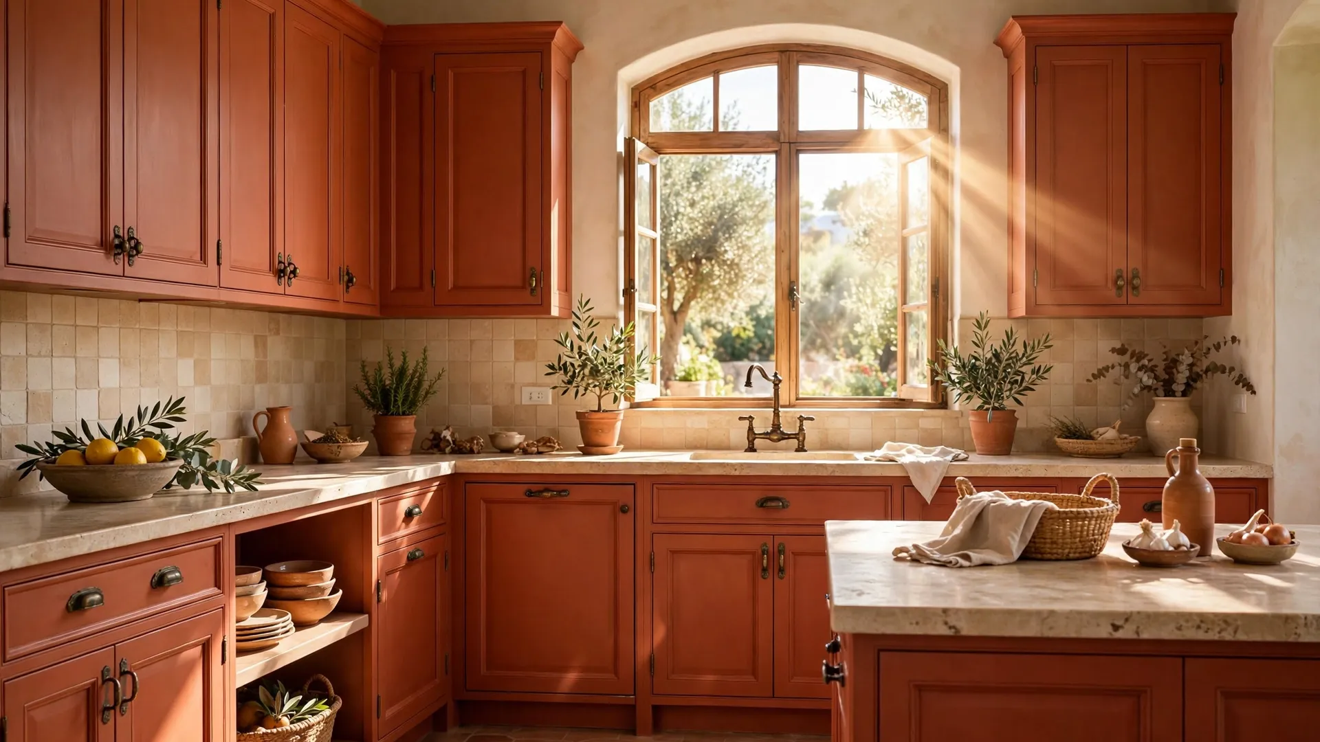
Terracotta cabinets are for the bold-hearted — a warm, earthy reddish-orange that instantly makes a kitchen feel sun-baked and soulful. Inspired by Mediterranean and Southwestern design, terracotta brings a rich, artisanal character that turns an ordinary kitchen into a conversation piece. Because it is such a strong color, balance is key: pair terracotta cabinets with creamy white countertops, a simple handmade-look backsplash in warm white, and light walls so the color can breathe. Natural wood floors or a wood-topped island complement terracotta beautifully, and aged brass or bronze hardware enhances its earthy warmth. Keep decor simple and textural — woven baskets, clay pottery, linen curtains, and a few green plants let the cabinets be the star. Terracotta works best as an accent: many homeowners paint just the island or lower cabinets terracotta with warm white uppers. It is not for everyone, but if you love warm, collected spaces, nothing else comes close.
15. Rich Walnut Stain
Not every cabinet color comes from a paint can — a rich walnut stain is a timeless "color" choice that brings natural warmth and depth no kitchen paint can quite replicate. Walnut's deep brown tones with their beautiful grain feel luxurious and grounding, working equally well in mid-century modern, rustic, and transitional kitchens. Pair walnut lower cabinets or a walnut island with creamy white uppers for a classic mixed-material look, or go all-walnut for a rich, enveloping feel in a larger kitchen. Light countertops — white quartz, creamy marble-look, or light concrete-look — provide essential contrast, and brass or matte black hardware both look stunning against the dark wood. Walnut loves texture: woven bar stools, a patterned runner, and greenery keep it from feeling heavy. As a bonus, stained wood hides wear and touch-ups better than almost any paint, and it never needs repainting — just the occasional oiling to keep it glowing.
Styling Tips
Choosing the color is only half the job — how you style around it makes the color sing. Start by testing paint swatches directly on your cabinet doors, not just on the wall, and look at them at different times of day. Kitchen lighting changes everything: a gray that looks perfect at noon can turn purple under warm evening bulbs, and north-facing kitchens make colors read cooler. Always test with your actual lighting, including under-cabinet lights if you have them.
Think of your cabinet color as part of a trio with your countertop and backsplash. A good rule of thumb: if your cabinets are bold or dark, keep counters and backsplash light and simple. If your cabinets are white or neutral, you have room to play with a patterned backsplash or a dramatic stone. The three should share at least one undertone — warm with warm, cool with cool — to feel cohesive rather than chaotic.
Hardware is the jewelry of the kitchen, and it can completely change how a cabinet color reads. Brass and gold warm up cool colors like navy, gray, and dusty blue; matte black adds modern contrast to whites, creams, and greens; and brushed nickel or chrome keeps things classic and seamless. Do not be afraid to mix metals thoughtfully — for example, brass cabinet pulls with a matte black faucet — as long as you repeat each finish at least twice in the room.
Finally, finish is a practical decision, not just a pretty one. Satin or semi-gloss paint on cabinets wipes clean far more easily than flat or eggshell, which matters in a room full of cooking splatter and little hands. And whatever color you choose, add warmth through texture: wooden cutting boards, woven baskets, linen curtains, and a few living plants make any cabinet color feel like home.
Frequently Asked Questions
What is the most popular kitchen cabinet color right now?
White remains the most popular cabinet color overall because it is timeless, bright, and appeals to future buyers. That said, sage green, warm greige, and deep navy have surged in popularity over the last few years and show no signs of fading. If you want a color that feels current but will not look dated quickly, sage green and warm neutrals like greige and putty are the sweet spot — trendy enough to feel fresh, classic enough to last.
Should kitchen cabinets be lighter or darker than the walls?
There is no strict rule, but most designers recommend keeping cabinets and walls in the same tonal family with some contrast between them. A common winning formula is slightly darker or more saturated cabinets against lighter walls — for example, sage cabinets with warm white walls — which gives the cabinetry presence without closing in the room. If you love dark cabinets like navy or forest green, light walls and good lighting keep the balance right.
What cabinet color makes a small kitchen look bigger?
Light colors reflect more light, so whites, creams, pale grays, and soft dusty blues make small kitchens feel more open. Just as important: keep the upper cabinets light even if you go darker on the lowers, and choose a backsplash and countertop close in tone to the cabinets so the eye flows uninterrupted. Glossy or satin finishes also bounce light around better than flat finishes.
Can I paint my kitchen cabinets myself, or should I hire a pro?
You can absolutely DIY painted cabinets with great results if you prep properly — and prep is everything. Clean thoroughly with a degreaser, sand lightly, use a high-quality bonding primer, and apply two to three thin coats of a cabinet-specific enamel paint with a fine foam roller or sprayer. Take doors and hardware off and label everything. A professional spray finish is smoother and more durable, so consider hiring out if your cabinets have heavy wear or intricate detailing.
How do I choose a cabinet color that goes with my existing countertops and floors?
Start with what you cannot easily change — usually the flooring and countertops — and pull your cabinet color from their undertones. Warm-toned granite or wood floors pair best with warm cabinet colors like cream, greige, sage, or olive. Cool gray tile or white quartz pairs well with crisp white, light gray, navy, or dusty blue. Hold paint swatches directly against your counters and floors in your kitchen's lighting before deciding; undertones that clash will jump out immediately.
Will bold cabinet colors hurt my home's resale value?
Not necessarily, but neutrals are the safest bet for resale. Whites, creams, light grays, and greiges appeal to the widest range of buyers. Bold colors like navy, forest green, and terracotta can actually help a home stand out in listing photos when done well — many buyers love a kitchen with personality. If resale is a near-term concern, consider using bold colors on the island only, which is easier and cheaper for a future buyer to repaint than full cabinetry.
Conclusion
The right cabinet color does more than change how your kitchen looks — it changes how your kitchen feels to live in. Whether you fall for the timeless brightness of classic white, the earthy calm of sage and olive, the quiet drama of navy and forest green, or the sunny charm of buttery yellow, there is a shade on this list that fits your style, your light, and your life. Take your time, test your swatches, and trust your gut. Pin your favorites, live with the samples for a few days, and then enjoy the transformation — few home projects deliver this much joy per dollar. Happy painting!


