

Modern interior design often focuses on perfection, luxury, and polished finishes. However, many homeowners are now embracing a more meaningful approach that celebrates simplicity, authenticity, and natural beauty. The wabi sabi color palette represents this philosophy by using soft, earthy, and calming shades inspired by nature.
Wabi sabi design comes from Japanese aesthetics that appreciate imperfection, aging materials, and the beauty of everyday objects. Instead of bright artificial colors or overly decorative spaces, this style creates peaceful environments using warm neutrals, muted greens, natural browns, and gentle stone-inspired shades.
A carefully selected wabi sabi color palette can transform any room into a relaxing sanctuary. These colors work beautifully with organic materials such as wood, clay, linen, stone, and handmade ceramics. The goal is not to create a perfectly styled room but to build a space that feels comfortable, balanced, and connected with nature.
This interior style works well for bedrooms, living rooms, kitchens, bathrooms, and workspaces. By combining natural colors with imperfect textures, homeowners can create spaces that feel timeless rather than influenced by temporary trends.
The popularity of wabi sabi interiors has increased because people are searching for calmer homes that support relaxation and mindfulness. Soft colors help reduce visual clutter while creating a warm atmosphere where people can feel comfortable and grounded.
The wabi sabi color palette is not limited to a single group of shades. Instead, it includes a wide range of natural-inspired tones that reflect forests, deserts, oceans, and earth elements. From warm beige walls to olive green plants and handmade wooden furniture, every element contributes to a peaceful visual experience.
What Is a Wabi Sabi Color Palette?
A wabi sabi color palette is a collection of natural, muted, and imperfectly beautiful colors used in interior design. These shades are inspired by organic landscapes, weathered materials, and traditional Japanese aesthetics.
Unlike modern interiors that often use strong contrasts and bold colors, wabi sabi design focuses on harmony. The colors appear soft and aged, creating a feeling of warmth and simplicity.
Common colors include:
| Color | Inspiration | Interior Effect |
| Warm Beige | Sand and natural stone | Creates calm backgrounds |
| Soft White | Aged paper and linen | Adds brightness without harshness |
| Clay Brown | Pottery and earth | Brings warmth |
| Sage Green | Plants and forests | Creates freshness |
| Taupe | Weathered wood | Adds elegance |
| Charcoal Gray | Natural rocks | Provides balance |
| Sandstone | Desert landscapes | Creates comfort |
The beauty of these colors comes from their ability to work together naturally. They do not compete for attention but instead create a peaceful environment where furniture, plants, and textures become part of the overall design.
A wabi sabi home often avoids perfectly matching colors. Small variations in shades make the space feel authentic and lived-in. For example, different beige tones across walls, furniture, and fabrics can create depth without making the room feel busy.
Why Natural Colors Matter in Wabi Sabi Design
Natural colors are essential because wabi sabi philosophy focuses on connection with the environment. These shades remind people of forests, mountains, oceans, and handmade objects.
Using natural tones can make interiors feel more relaxing because they create visual balance. Unlike bright synthetic colors, earthy shades are easier on the eyes and support a peaceful atmosphere.
Benefits of natural colors include:
- Creates a relaxing environment
- Makes rooms feel warmer
- Supports minimalist decoration
- Highlights natural materials
- Provides timeless appeal
- Works with different design styles
A room designed with natural colors can easily adapt as furniture changes over time. This flexibility makes the wabi sabi approach practical for homeowners who prefer long-lasting designs.
Pro Tip:
Combine different shades from the same color family instead of choosing identical colors. Slight variations create the authentic imperfect beauty that defines wabi sabi interiors.
Main Elements of a Wabi Sabi Color Palette
The foundation of a successful wabi sabi interior comes from understanding how different colors interact. Each shade should support the feeling of simplicity, comfort, and connection with nature.
Earthy Neutral Shades for Wabi Sabi Interiors
Neutral shades form the base of most wabi sabi spaces. Colors like beige, cream, taupe, and soft gray create peaceful backgrounds that allow natural textures to stand out.
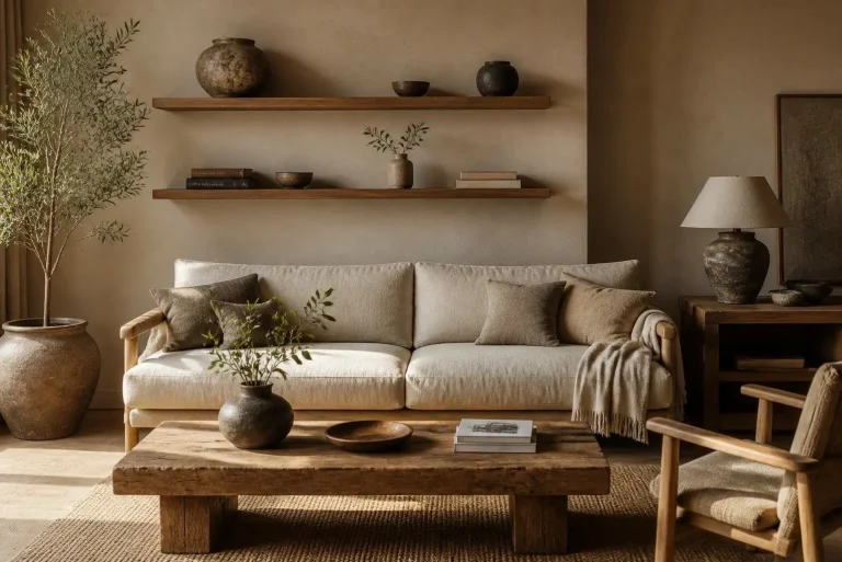
Walls are often painted in warm neutral shades instead of bright white because softer colors create a more welcoming environment. These tones work especially well with wooden floors, linen curtains, and handmade decorations.
| Shade | Best Used For |
| Cream | Walls and fabrics |
| Beige | Furniture and rugs |
| Taupe | Accent walls |
| Warm Gray | Modern wabi sabi spaces |
| Off White | Minimal interiors |
These colors create flexibility because they pair well with almost every natural material. A beige wall combined with wooden furniture and green plants creates a balanced and organic atmosphere.
How to Add Green Shades Through Wabi Sabi Plants
Plants are an important part of wabi sabi interiors because they introduce natural movement and life. Wabi sabi plants usually include simple, low-maintenance greenery that complements the calm color scheme.
Popular plant choices include:
- Olive trees
- Bamboo plants
- Snake plants
- Ferns
- Bonsai trees
- Dried grasses
- Peace lilies
Green shades work beautifully with neutral colors because they add freshness without overwhelming the space.
| Plant Type | Color Effect | Best Location |
| Olive Tree | Soft gray-green | Living room |
| Bonsai | Deep natural green | Desk area |
| Fern | Fresh green texture | Bathroom |
| Dried Grass | Beige tones | Bedroom |
Plants should look natural rather than perfectly arranged. Slightly uneven growth and organic shapes are considered beautiful in wabi sabi philosophy.
Important Note:
Avoid overcrowding your space with too many plants. Wabi sabi design focuses on intentional placement rather than excessive decoration.
Choosing Furniture That Matches a Wabi Sabi Color Palette
Furniture plays an important role in completing a wabi sabi color palette because the philosophy focuses on natural materials, handmade details, and simple forms. Instead of selecting furniture with glossy finishes or complicated designs, wabi sabi interiors prefer pieces that show texture, age, and character.
Wood is one of the most important materials in wabi sabi furniture. Natural wood grains, small imperfections, and uneven textures create authenticity. Oak, walnut, reclaimed wood, and bamboo furniture work especially well with earthy tones.
Furniture colors should complement the surrounding environment rather than dominate the room. Warm browns, soft beige fabrics, muted gray finishes, and natural wood tones create harmony.
A simple wooden table, linen sofa, handmade cabinet, or textured chair can become a statement piece without requiring decorative accessories.
| Furniture Material | Color Appearance | Wabi Sabi Effect |
| Natural Wood | Brown and honey tones | Adds warmth |
| Stone | Gray and beige shades | Creates grounding |
| Linen Fabric | Soft cream colors | Adds comfort |
| Clay Ceramic | Earth tones | Provides handmade beauty |
| Bamboo | Light natural shades | Creates organic feeling |
The goal is to create a home that feels connected to nature. Furniture should look comfortable, functional, and timeless rather than expensive or overly designed.
Wabi Sabi Side Table Ideas for Natural Interiors
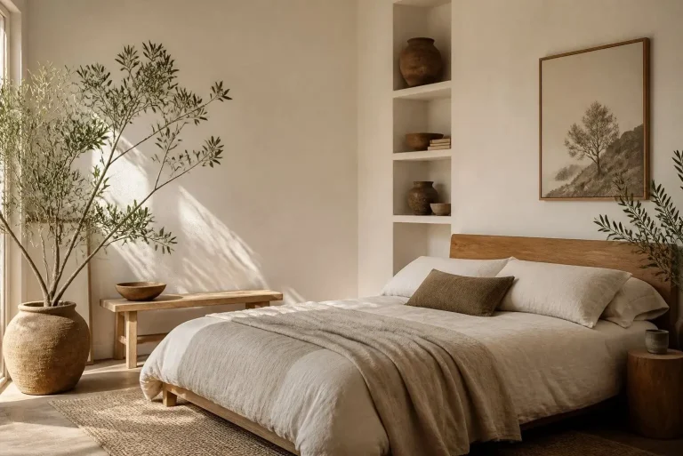
A wabi sabi side table is an excellent way to introduce this design philosophy into any room. Side tables may appear small, but they can strongly influence the overall atmosphere of a space.
Traditional wabi sabi side tables often feature natural wood, stone surfaces, irregular shapes, or handmade craftsmanship. These details create visual interest while maintaining simplicity.
A perfect side table does not need a perfect finish. Small cracks in wood, visible grain patterns, or uneven textures add personality and reflect the beauty of imperfection.
Best Wabi Sabi Side Table Materials
| Material | Characteristics | Suitable Room |
| Reclaimed Wood | Aged appearance | Living room |
| Natural Stone | Strong organic texture | Bedroom |
| Bamboo | Lightweight and simple | Small spaces |
| Clay Ceramic | Handmade look | Decorative corners |
| Raw Timber | Rustic beauty | Modern interiors |
When styling a wabi sabi side table, avoid filling it with unnecessary objects. A single ceramic vase, a small plant, or a handmade lamp is usually enough.
The idea is to create intentional simplicity.
Wabi Sabi Side Table Styling Ideas
- Place a small bonsai plant on the table
- Add handmade ceramic bowls
- Use linen-covered books
- Include natural candles
- Display dried flowers
- Combine wood with stone accessories
These simple additions enhance the connection between furniture and nature.
Pro Tip:
Choose furniture pieces that become more beautiful over time. Materials like wood and stone develop character as they age, making them perfect for wabi sabi interiors.
Combining Wabi Sabi Colors With Different Room Designs
The flexibility of a wabi sabi color palette makes it suitable for different areas of the home. Each room can use the same philosophy while creating a unique atmosphere.
Living Room Wabi Sabi Color Ideas
The living room is where family members relax and spend time together. Soft neutral colors help create a peaceful environment.
Recommended combinations:
| Wall Color | Furniture Color | Accent Shade |
| Warm Beige | Natural Wood | Sage Green |
| Soft White | Brown Leather | Clay Orange |
| Light Gray | Oak Furniture | Olive Green |
Add textured rugs, linen cushions, and handmade decorations to complete the look.
Bedroom Wabi Sabi Color Palette Ideas
Bedrooms benefit greatly from calm colors because they support relaxation. Earthy tones create a comfortable sleeping environment.
Popular combinations include:
- Cream walls with walnut furniture
- Taupe bedding with beige curtains
- Soft gray walls with natural wood accents
- Sage green accessories with linen fabrics
Avoid bright colors because they can disturb the peaceful feeling of the room.
Kitchen Design With Wabi Sabi Colors
A wabi sabi kitchen focuses on simplicity and natural materials. Wooden cabinets, stone countertops, and ceramic accessories work beautifully together.
Recommended elements:
- Matte wooden cabinets
- Handmade pottery
- Natural stone surfaces
- Neutral backsplash colors
- Open wooden shelves
A kitchen designed this way feels warm, functional, and connected to traditional craftsmanship.
How to Balance Modern and Traditional Wabi Sabi Styles
Many homeowners worry that wabi sabi interiors may look too rustic or old-fashioned. However, this style can easily combine with modern design elements.
Modern wabi sabi interiors often include:
- Minimal furniture layouts
- Contemporary lighting
- Simple architectural lines
- Neutral color schemes
- Natural decorative pieces
The key is maintaining balance. Modern elements should support the natural beauty of materials instead of replacing them.
For example, a modern sofa can work perfectly with a handmade wooden side table. A simple pendant light can complement a clay vase and natural plants.
Common Mistakes When Creating a Wabi Sabi Color Palette
Although wabi sabi design looks simple, creating the right balance requires careful planning.
Mistakes to Avoid
Using Too Many Colors
A common mistake is adding many different shades. Wabi sabi interiors usually work best with a limited color range.Choose three to five main colors and allow textures to create visual interest.
Choosing Artificial-Looking Materials
Plastic furniture, glossy finishes, and synthetic decorations can reduce the natural feeling.
Instead, select:
- Wood
- Stone
- Cotton
- Linen
- Clay
- Bamboo
Making the Space Too Empty
Minimalism does not mean creating an empty room. Wabi sabi focuses on meaningful objects rather than having no decoration. Each item should have a purpose or emotional connection.
Warning:
Avoid copying perfectly styled showroom designs. Authentic wabi sabi spaces should feel personal, comfortable, and slightly imperfect.
Wabi Sabi Color Palette Checklist for Your Home
Use this checklist when designing your own space:
☐ Choose warm natural wall colors
☐ Include wood or stone materials
☐ Add plants with organic shapes
☐ Select handmade decorations
☐ Use soft lighting
☐ Avoid excessive decoration
☐ Mix different natural textures
☐ Choose furniture with character
☐ Maintain simple layouts
☐ Focus on comfort over perfection
Final Design Tips for a Timeless Wabi Sabi Home
Creating a successful wabi sabi color palette is about more than selecting colors. It is about building a relationship between materials, furniture, lighting, and natural elements.
Small imperfections should be appreciated instead of hidden. A slightly uneven wooden surface, handmade ceramic piece, or naturally shaped plant can become the most attractive feature in the room.
Focus on quality instead of quantity. Choose fewer items that have meaning and create emotional connection.
A peaceful home does not require expensive decorations. With thoughtful color choices, natural materials, and simple furniture, anyone can create a wabi sabi-inspired environment.
Conclusion
The wabi sabi color palette offers a timeless approach to interior design by focusing on natural beauty, simplicity, and authentic materials. Soft earth tones, muted greens, warm neutrals, and organic textures create spaces that feel peaceful and welcoming.
By combining natural colors with elements like wabi sabi plants and a carefully selected wabi sabi side table, homeowners can create interiors that reflect comfort and balance.
Unlike temporary design trends, wabi sabi celebrates things that improve with time. The beauty comes from imperfections, natural aging, and meaningful objects.
Whether you are redesigning a single room or creating an entire home, choosing a wabi sabi-inspired color scheme can help build a space that feels calm, connected, and timeless.


